This is a guest blog post by Ramin, the creator of @StatsTeslaApp. Thank you Ramin!
I am the developer of the Stats app for Tesla and these are some of the questions and concerns that I frequently get from Tesla owners:
- My Tesla is only x months old and I am concerned about losing y% of range during this short period of time.
- If this rate of range loss continues, my range will be half of what it is now very quickly.
In this short article, I will attempt to shine some light on the matter of Tesla battery degradation.
TL;DR: There is nothing to be worried about in the vast majority of cases.
What is normal degradation
The capacity of a battery to store energy is naturally reduced with each charge/discharge cycle. This is true about your phone battery and all rechargeable battery technologies that are available today. Tesla battery management system is one of the best in the industry and it attempts to reduce the rate of this natural degradation.
Let’s look at some data to back up this claim. The following graphs (Figure 1) show the maximum range of Tesla Model 3 (Long Range, Rear Wheel Drive and All-Wheel Drive models). These graphs should put your mind at ease because they clearly show that while the maximum range declines during the first 15k to 20k miles, the decline quickly levels off and stabilizes.
This accelerated decline at the beginning is a characteristic of most commercial rechargeable batteries that exist today.
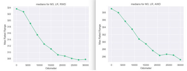
Figure 1: Rate of Decline Levels off After 15-20k miles (averaged across all users)
I hope, at this point, you are reasonably assured that your car’s battery is not defective even if you have seen some decline in the maximum range.
Stop monitoring your max range every hour
Unlike measuring the amount of gas in an ICE car, measuring battery capacity is not straightforward. For a little more technical explanation of why that is the case, I refer you to this article (it’s not very technical).
Since the exact battery capacity cannot be measured accurately, the estimated value of this quantity can fluctuate. Figure 2 is a good example which demonstrates this fluctuation. Each orange dot represents a single measurement of max range performed at a particular odometer value. While the trend line (the blue line) is informative, the individual measurements are noisy and should not be relied upon in isolation.
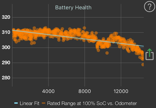
Figure 2. Source: Stats for Tesla App
Figure 3 is another Battery Health graph for a car with that more mileage (see the horizontal axis which is the odometer value in km). This is another way of showing that the battery degradation levels off as the mileage increases (a fact that we also observed in Figure 1 above).
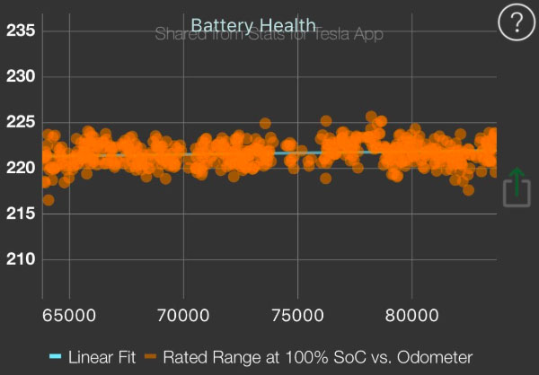
Figure 3. Source: Stats for Tesla App
Is my battery range worse than others
This is another question that I get a lot from people when they share their Battery Health graph.
It is possible to compare the max range of a car which that of other cars with approximately the same number of miles (i.e., odometer value). It requires filtering the data based on model and odometer value and creating histograms and using the histogram to determine what percentage of similar cars with similar mileage are better/worse than your car.
I have created a tool to do exactly that. Here is an example which shows a Model 3, LR AWD car whose current battery level is at 50% and the current remaining range is 155 miles. The name of the app is Battery Compare (also available for Mac). Note that this app is for the following Model 3 cars only: “Long Range, RWD”, “Long Range AWD (aka Dual Motor)” and SR+.
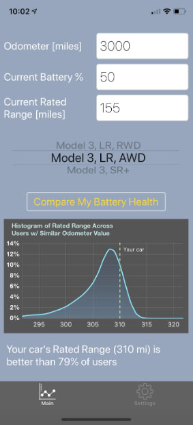
Figure 4. Source Battery Compare App
I hope you have found this short article useful. If you have more questions, you can find me on Twitter @StatsTeslaApp
Questions? Reach out at contact@tesletter.com
Have you not ordered your Tesla yet? Use my referral code http://ts.la/ignacio9266


